Design Systems Thinking Post 4

How fitting is it that the last blog post I’m writing for my undergrad career at SPU is one about designing for good. I remember writing my application essay to the major my spring quarter of my freshman year, and saying that I wanted to use design as a means of change. I laugh back at that because I had NO idea the implications of that. My idea of design at that time was so much based in visual form, not in thinking. Somehow I thought perfectly kerned type (not that I could even properly kern at that point) was the way I was going to change the world. I can only laugh at that now.

But now I understand that designing for good is much more of a thinking process than a visual process. It means finding a need, a passion, something that you desperately want to be involved in, and researching it. Prototyping a solution. Researching again. Prototyping again. Gathering feedback. Revising, revising, revising, all to come to a solution that addresses a problem or a need in the most coherent way possible – which doesn’t always mean the most jaw-droppingly beautiful. Design thinking is without a doubt a way to engage the culture.

It’s my hope that as I transition into a career, I’m able to focus my work on this kind of process. I want to be an intelligent creator. I want to constantly ask questions. I want to constantly be engaged with other people who are also constantly asking questions. I want to be a part of an industry that aims to problem solve to find the best solutions. And I’m hopeful that I will be able to do just that.

But most of all, I just never want to stop learning, because I don’t think it’s possible to design for good without pursuing understanding as well.


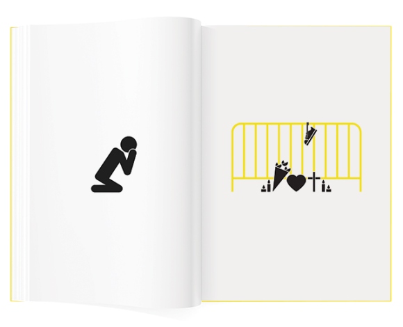
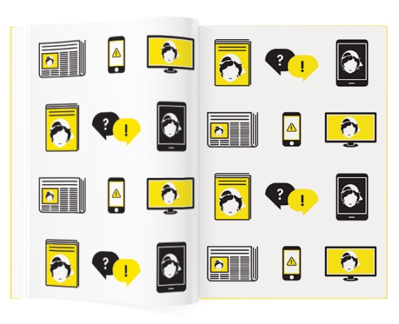
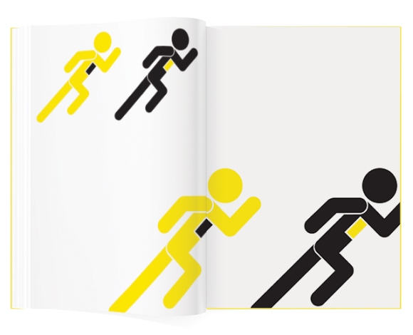
One of the Design for Good examples on AIGA’s website that resonated with me especially was an iconographic book telling the story of the Boston Bombing, entitled 102 Hours, by Tank Design Inc. Maybe it’s because we’re so close to June 5th, and that makes me especially responsive to this kind of storytelling, but there was something in the universality of the symbols they used that made this feel like a collective story – that we were all in this grief thing together. And there’s something really, really powerful in that. Sometimes design is a process for your own healing, and sometimes it’s for collective healing. And I’d say that’s definitely Design for Good.

boston2boston3

source: http://seattle.aiga.org/designforgood/
Design Systems Thinking Post 3

Meredith Davis’s article “Building a Culture of Design Research” definitely struck a chord with me. I was really frustrated with the opening anecdote on the study done on the prevalence of research in undergraduate study, especially that “for most undergraduate students, research means library retrieval only and focuses on the subject matter of their design, not on the characteristics of users or context.” I’ve been told time and time again in the last year or two that to be a successful designer, it’s necessary to immerse yourself in all kinds of subjects, in the design field or otherwise. Of course, it’s critical to research the specific subject for a particular project, but we cannot just be limited to that. If we fail to also research audience and user needs, cultural or societal context, existing competition or attempts at a solution or other big-picture topics, I don’t think it’s truly possible to arrive at the best solution. It makes me sad that that’s a component missing in so many undergraduate (and graduate) programs given the way our role as designers has shifted. Davis noted this change, saying that the “goal today [in design] is not to simplify things, as we did under modernism, but to manage them” and that “design is no longer at the cosmetic end of a decision-making food chain but a necessary partner with a variety of disciplinary experts.”

Davis also said that “undergraduate curricula generally infer that the way to begin work on a design problem is by drawing, that solutions reside in an abstract visual language, and that reading and writing belong primarily to the domains of history and criticism.” This statement completely embodies one of my biggest struggles as a designer. I identify much more as an analytical than a creative thinker, and over the past four years, I’ve found myself very challenged when I start a project from a visual place. I find myself brainstorming more using words than sketches, which always seemed like the wrong way to do it in such a visual field. And yet, it seems to work better for me. The projects where I’ve started with research or writing, like our capstone project, I’ve found to be much more conducive to developing my thinking in a stronger way, which then leads to a stronger end product – both visually and content-wise. I’m incredibly glad that my education has allowed me to develop research skills that I might not have in other programs – I feel much more prepared as a thinker, which has helped me immensely to be prepared as a designer.

This is just a simple example of how multi-faceted research can/should be when developing a solution to a problem. This kind of research takes into account  multiple subject areas to lead to a cohesive solution.  source:  http://community.vfs.com/oomph/2012/07/karen-whistler-at-idsa-2012-systems-thinking-applications-for-design/

This is just a simple example of how multi-faceted research can/should be when developing a solution to a problem. This kind of research takes into account multiple subject areas to lead to a cohesive solution.
source: http://community.vfs.com/oomph/2012/07/karen-whistler-at-idsa-2012-systems-thinking-applications-for-design/

Source: Building a Culture of Design Research, Meredith Davis. https://segd.org/building-culture-design-research-0

Design Systems Thinking Post Two

I resonated especially with the first part of this reading (Visual Research by Ian Noble and Russell Bestley): focusing on asking the question “what am I attempting to achieve with XYZ project?” This is a question I don’t ask myself nearly enough: in a school based setting, many times this is briefly outlined for me, and I don’t give much more thought to it, and instead get straight into the ideation process. However, taking a detailed and methodical approach to this question is a practice that I hope, in time, will become instinctual rather than a chore.

This reading, outlines the first step of that approach: the design brief, which can be broken down into three main components.

First is identifying the field of study. The field of study is the broad context for the work to be undertaken. To work successfully on a project, a designer needs to first understand the subject surrounding the project as much as possible, which means research, research, research. It could be research about an audience, a market, competing messages, vocabulary related to the subject, and even cost implications.

After gaining some understanding about the field of study, the second component of a design brief is identifying the project focus. This step involves determining the exact intentions of the specific project within the context of the larger field of study. This can be undertaken in two ways. First is by using the context-definition model, which involves a thorough understanding of the context in order to meet a need that is found in that understanding. Second is the context-experiment model, which requires some understanding of the context, but then experimenting and prototyping multiple ideas to refine them and eventually arrive at a final solution through other failed ideas.

The third component of the design brief is identifying one’s research methodology. After taking into account the information pertinent to the project, defining a research methodology takes that information and translates it into an outline of exactly how a project will be developed. These are self-imposed rules and provide steps and a timeline to arrive at a final solution.

Going through each of these steps to develop a design brief is one way to ensure that a project is able to fulfill its needs in the best way possible. A methodical approach is one that eliminates ambiguity and provides strong framework for asking and answering questions in the most efficient way possible.

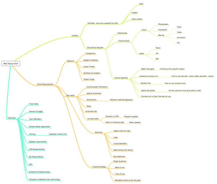
This flowchart is an example of the scope of thinking required in a design brief. It exemplifies an all-encompassing way of thinking, because it takes into account research, needs, limitations, sets tasks for individuals, goals, client needs, among others. This kind of preparation allows a methodical approach for the duration of the design process.  Source: http://tamixes.onsugar.com/tag/mind-map#.VStqPBPF-Vs

This flowchart is an example of the scope of thinking required in a design brief. It exemplifies an all-encompassing way of thinking, because it takes into account research, needs, limitations, sets tasks for individuals, goals, client needs, among others. This kind of preparation allows a methodical approach for the duration of the design process.
Source: http://tamixes.onsugar.com/tag/mind-map#.VStqPBPF-Vs

Works cited:
Noble, Ian, and Russell Bestley. Visual Research: An Introduction to Research Methodologies in Graphic Design. Lausanne: AVA Academia, 2011. Print.

Design Systems Thinking Post 1

Without even knowing the terminology for it, design thinking has been what I’ve wanted my design process to look like for quite some time. While I love some of the grittier details of design, like typesetting or meticulously keyframing an animation, I often find myself longing for my design work to meet a need in peoples’ lives. Will a carefully kerned headline really make a difference in somebody’s everyday life? Or does my work need to go beyond that?

In “Design Thinking for Social Innovation,” Tim Brown and Jocelyn Wyatt explore the middle ground that design thinking creates between analytical thinking (the gritty side) and human-based feelings (the human side) as a means of effective problem solving, and how it can be incredibly beneficial as an agent for social change and improvement. Traditionally, designers have been more focused on “enhancing the look and functionality of products,” but with the rise of design thinking, are changing their focus to a broader look at the human experience and how it can be better engineered.

Brown and Wyatt continuously reiterate through case studies that effective design thinking is a process that needs to be incredibly responsive to the client or customer’s needs, rather than isolated to what the design team thinks is best. This requires careful observation, prototyping, and revisions, especially if major cultural differences exist. What seems like an obvious solution to a problem to a designer might not actually be beneficial if it doesn’t take into account how the user actually lives and interacts with the product, and what their needs actually are.

Design thinking allows room for a new kind of innovation – innovation that isn’t always flashy. A high tech product isn’t actually innovative if the user doesn’t know how to use it, or doesn’t want to use it, while a solution that seems simple enough for an elementary schooler to think of might actually be more innovative if it solves a problem more effectively. In this way, the design process is user-centered, which, if implemented correctly, can produce results far superior than traditional design thinking.

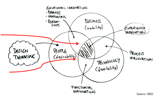
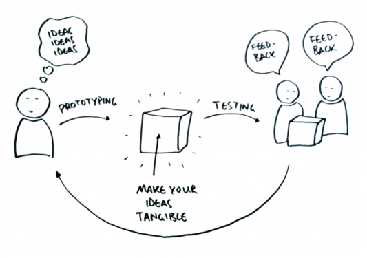
I found several diagrams put out by IDEO, one of the pioneers in design thinking that illustrate quite cogently the tenants of design thinking, two of them are below.

This venn diagram addresses that there are multiple variables that go into design thinking. When all of them are considered, it becomes easier to find a solution that is truly innovative for a problem at hand. If only one is considered, however, it may be possible to arrive at what appears to be an innovative solution, but might not actually address the problem in the most complete way possible.  Source: IDEO, found at http://dthsg.com/what-is-design-thinking/

This venn diagram addresses that there are multiple variables that go into design thinking. When all of them are considered, it becomes easier to find a solution that is truly innovative for a problem at hand. If only one is considered, however, it may be possible to arrive at what appears to be an innovative solution, but might not actually address the problem in the most complete way possible.
Source: IDEO, found at http://dthsg.com/what-is-design-thinking/

This diagram shows that design thinking must be a cyclical and fluid process that involves iterations of prototyping - so that the designer can actually get a complete look at how the user actually uses the implemented solution.  Source: IDEO, found at http://dthsg.com/what-is-design-thinking/

This diagram shows that design thinking must be a cyclical and fluid process that involves iterations of prototyping – so that the designer can actually get a complete look at how the user actually uses the implemented solution.
Source: IDEO, found at http://dthsg.com/what-is-design-thinking/

Works Cited:

Brown, Tim, and Jocelyn Wyatt. “Design Thinking for Social Innovation.” Stanford Social Innovation Review 2010: n. pag. Web. 07 Apr. 2015

“What Is Design Thinking?” University of St. Gallen. N.p., n.d. Web. 07 Apr. 2015.

Information Design Post #6

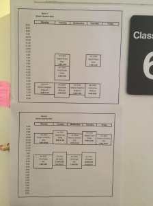
In this class, I’ve challenged myself to look at the stupidly simple information design in my life – so that I can think about how I interact with even the most basic information, and work my understanding up from there. As such, the example from my life that I chose this week is the room scheduling sheets that are up in the art center. These have been some of the most important pieces of information during my time as an art student, and I use them constantly. So now I’m asking: what works, and what doesn’t? The vertical calendar, breaking it up by day, definitely works. With a quick glance I can see what is blocked out, and what isn’t. But I’m not sure the hierarchy is quite right to convey the information most effectively. My first read is the text, not the blocks. A simple fix to that would be to add shading to the block and/or making the type smaller. 95% of the time I’m looking at these sheets, I just need to know if the room is available, not what class is meeting there, so adjusting that hierarchy would assist with that.

IMG_1278

Looking at these sheets individually helps if you need a specific room. But what if you just need a space in the art center, not a particular one? It seems overly complicated to have to go to from one room to another just to mentally compile that information. So why not aggregate all of the room availability information into one visual, to be placed near the entrance of the art center? This raises the question of how data is represented. Both of these visualizations use the same set of information. But they’re presented in different ways, because they’re answering different questions. So then, that just means as information designers, we need to anticipate multiple questions our audience might be asking, and let our design follow suit.

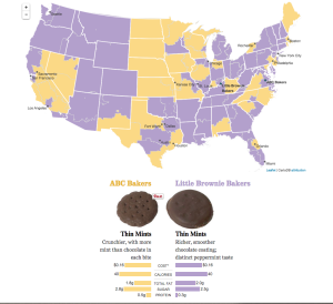
On a completely different subject, the found information design I’m drawing from this week relates to the best part of the year: Girl Scout Cookie season – and where the cookies come from. This informational article & video on the Los Angeles Times explains a pretty big component of cookie season: the fact that the cookies are made in two different bakeries. I was drawn to this example because it handles a lot of different kinds of information – and not just the kind that can be quantified or represented in explicit statistics.

First, the article presents a map, showing which bakery supplies which areas of the country. It’s quickly color codified, and the colors are used consistently throughout the rest of the information. This information is straightforward.

But then the information becomes less statistical, as it begins comparison between the cookies from each bakery. There’s actual pictures of the cookies to show the differences, flavor profiles, and then pure data comparison for things like nutritional values and cost per cookie.

A final piece in this package is a video doing real life taste comparisons between the two bakery’s cookies. What was particularly notable about this video for me, though, is that it continued to use the same color codification throughout, which made the whole package incredibly cohesive.

This information design doesn’t contain a lot of meat – but it’s definitely interesting and engaging, and does provide an educational message. After all, you’re not going to think about what Girl Scout cookies you’re missing as you’re chowing down on the ones available in your own area.

works cited:

Lin II, Rong-Gong, Jon Schleuss, and Rosanna Xia. “6 Girl Scout Cookies You Thought You Were Getting but Aren’t.” Graphics.latimes.com. LA Times, 4 Mar. 2015. Web. 04 Mar. 2015. <http://graphics.latimes.com/girl-scout-cookies/&gt;.

Information Design Post 5

Let’s talk about a drier side of information design: medication packaging and labeling. Boring? Perhaps. Important? Absolutely. This is the kind of information design that’s so ingrained into our lives that we hardly notice it anymore; we’re so accustomed to the format of warning and dosage labels that we don’t really give them a second thought. In the age of striking infographics and flashy interactive information design, sometimes it can be hard to remember that sometimes information design doesn’t need a dose of creativity – sometimes it has to be completely objective for the sake of coherence. Sure, dosage instructions could probably be represented visually, and an iconographic set of symbols could probably be created to represent side effects of drugs, but I would argue that wouldn’t serve the purpose of the drug fact panel as well. Medicine might be one of the places where it is inherently better to tell instead of show – for legal reasons as much as reasons for coherence. In this instance, telling the information using words instead of showing it through symbols leaves no room for misinterpretation or subjectivity – which is obviously critical when some drugs can have life or death implications. I’m not arguing that symbols couldn’t be used in addition to the written instructions, or that the drug fact panels are perfectly designed (I would add a better sense of hierarchy – do the inactive ingredients really deserve as much visual weight as the dosing instructions, for example?), but I am certainly arguing that this is an instance not of ‘if it ain’t broke, don’t try to fix it,’ but of ‘don’t try to fix it only for the sake of visual aesthetic,’ something that may be difficult for designers to swallow.

Rub-On-Relief-Drug-Facts IMG_1238

In my own life and interaction with medication packaging/labeling, I hadn’t thought much about this side of information design until I switched pharmacies and was given my birth control in new packaging. Instead of receiving a pack of pills that was arranged in rows resembling a calendar, I received a circular case that had a dial that you spin each day to dispense that day’s pill out of a single whole in the back. It’s really nothing remarkable, but I’ve found that it adds an extra layer of information to my pack of pills. The first layer is the pills themselves and the day of the week marker: both allow me to keep track of where I am in the pack of pills, which helps keep me on schedule and remember to take them daily – something that’s pretty consistent among different birth control packaging. The second layer, though – the spinning dial – exemplifies how UX design can help reinforce information design. By manually spinning the dial each day, I have one more action to log in my mind reminding me that I had taken my pill for the day – meaning it’s that much easier for me to remember if I’ve taken it or not. It sounds stupidly simple, but it has honestly improved my experience with taking this medication – showing that information design needs to be thought of as an all-encompassing design field. Every aspect of a design needs to reinforce the message or information, including the experience the user has with it.

Information Design Post 2

IMG_5147

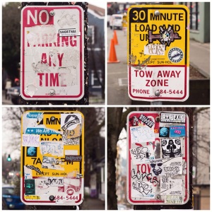
Last year, I did a photographic exploration of parking signs around Fremont and Queen Anne. My aim was to create a typology of something that is so incredibly common in our day-to-day life, but to find the unique ways humans have added their mark to the signs. The end result was a collection of images that was unified as a collection but contained remarkably unique individual images. I recently stumbled back across these photos and found that they were actually an interesting look into the information we need – or don’t need – as drivers.

We have been conditioned as humans to accept that red means stop, yellow means caution and green means go. This conditioning is evident in these parking signs – as the color of the sign or type is the first read, and the words themselves are the second read. That’s a great thing for signs that are almost completely covered in stickers and graffiti – because the information isn’t totally lost. Of course, it’s important for a driver to be able to identify the specific parking regulations on a sign, but if that’s inaccessible, a quick examination of the color may be all they need to determine if they should just keep driving, or actually try to disseminate the information further. Even if a sign wasn’t covered in stickers, the color codification is still critical to the ease of use of the signs. While driving, it would be unsafe to read every single sign, so a quick glance is all we can safely give until we’ve slowed down. Parking signs, then, have become a system that we don’t notice anymore because they’re so ingrained into our lives.

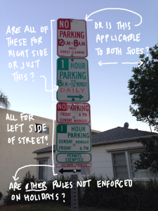
Compared to other cities I’ve visited, Seattle actually has relatively simple parking regulations. Sometimes color codification isn’t really going to be that helpful because there’s just a total deluge of information – information that HAS to be conveyed explicitly (not just generally like a color system does). The question, then, is if it has to be conveyed through type. Tradition and existing systems would say yes. After all, it’s how we’ve always done it. But is it truly effective – especially for signs that are as complicated as this?

tumblr_naxe5tPbBx1tsto3lo1_r1_1280

toparkornottopark.com

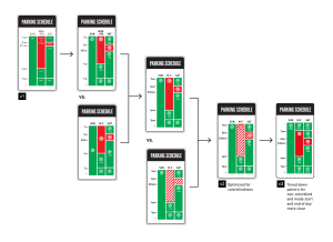
Last year, a design started floating around the Internet asking this same question. Designer Nikki Sylianteng decided to see if she could find a better way to organize the information in all of these separate signs and created a project called To Park or Not to Park. The basic premise of the redesign was to use colorblocking rather than excessive text to inform drivers if it was acceptable to park at a given time or not – which could potentially require a single glance instead of reading multiple signs (that were each incredibly specific). All drivers want to know is if they can park or not – not necessarily why or why not.

toparkornottopark.com

toparkornottopark.com

The whole project and Sylianteng’s thinking process is outlined on her website (toparkornottopark.com), and it’s incredibly fascinating to read through the feedback she’s received and her ideation process.

One question that I’ve pondered since discovering this project is if changing a familiar system to one that is seemingly better (more organized, easier to understand, etc.) is actually more problematic than just having a slightly less cogent system in place. Take the parking signs covered in stickers from Seattle. If we can still understand the information conveyed even without the bulk of the information actually visible – is that a system that is too widespread/familiar to be worth changing? I honestly don’t know the answer to this question (and I’d argue that it depends greatly from system to system), but it’s definitely important to think about.

Information Design Post 1

When we think of information design in terms of public transportation, the first name that comes to mind is Massimo Vignelli, for his 1972 redesign of the New York City subway map that focused on clarity of information. Though not well received by New Yorkers because it sacrificed geographic accuracy for clarity in the subway routes, Vignelli’s intentionality behind the redesign is something to be commended and examined.

However, a route map isn’t the only component involved in successful information design as it relates to the entire process of riding the metro. When I spent time in Europe this summer, I found myself comparing the metro systems in each of the cities I visited and eventually analyzing the shortcomings and strengths in them – just because I have an incredibly analytical mind. Thinking back, these are some of the things I valued in the information systems I encountered.

1. The Map: I found myself wanting a balance between Vignelli’s simplified map and an accurate geographic map. In cities I was unfamiliar with, it was important to have some geographic reference, but I didn’t need all the details of each and every street above ground. I remember being particularly impressed with Barcelona’s map.

2fb1cd4ff9141acd7f96428e5cd98fe1

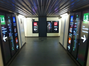
2. The signage: Almost all cities handled signage in the stations the same: each line had its own bright color, and the direction of the line would be determined by the last stop on each end of the line. Then there would be secondary signs that listed each remaining stop in that direction, making it a pretty quick process to determine which direction you needed to ride. The most important thing for this information was the consistent use of color – it made it easier to quickly assess the information. The only city I encountered that handled this differently was Milan, because some metro stations had regional trains going through them as well. Their labeling wasn’t specific enough, and caused problems in my navigation.

800px-paris_metro_-_ligne_1_-_dilidam_02

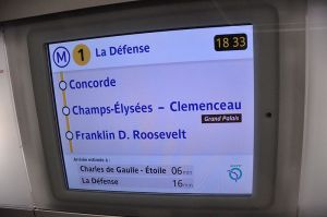
3. The ride: The most important (and most varied) information design I encountered was how stops are announced to passengers. In some cities, stops were only announced verbally. In others, there were indicator lights above the doors that showed which stations had already been passed, and which were coming. Others had a screen that showed the name of the stop. And some had a combination of these features. The metros I felt most comfortable on used at least two of these designs, especially if I didn’t speak the language in that country. Paris and Madrid’s metros stand out to me for this reason.

Expert Paths & Collaborations

This final chapter was an excellent culmination of all that had been discussed in the book by providing us explanations of what fields these skills can lead to. Rather than summarizing all of the careers discussed, I want to focus on the ones that interest me specifically.

Editorial design definitely interests me. An editorial designer will work with a variety of other content creators (writers, illustrators, photographers, etc.) to combine assets into a final publication, whether it’s intended for a print or digital medium. In many editorial design positions, there is flexibility in styling due to the varying types of content and audiences, while other contexts, like magazine design, may remain more consistient. However, in all types of publications, the work is almost exclusively driven by the content.

A successful editorial designer needs to have a strong understanding of hierarchy, grid systems and typography, as much of the work is layout driven. They also need to have an “accurate eye for content correction, whether it’s grammar, color or mood.” Some of the trickier aspects of the job include the amount of coordination for deadlines with others, since content comes from a variety of places, as well as the amount of corrections and proofing and editorial piece will go through (happily enough, those are two things that actually really excite me, not just because of the challenge, but because I think they play to my strengths).

Another field discussed in this chapter was information design, which isn’t something I’ve ever really considered as an option for myself before, but only because I haven’t been exposed to it as much as editorial design. However, I was especially interested in this field because it relies heavily on combining a creative and analytical mindset by merging design and data. An information designer takes complicated data and visualizes it in a clear, concise and easy to understand way. Therefore, to be successful, an information designer needs to be incredibly cognizant of how information is perceived and processed, which requires a precise attention to detail. Like editorial design, information design is entirely content driven; however, it is less subjective than many other design fields, simply because it is dealing with such concrete data.

To understand anything, it’s important to take a look at its history, so I wanted to research how information design has evolved into what it is today. I found an excellent post on a Huffington Post blog that delved into the more recent history of the infographic and a look at where it might be heading next.

It’s no secret that information design is nothing new. Charts, maps, tables, graphs, etc. have been around for a pretty long time. However, the digital world has ushered in a new era in which more data is being passed through the hands of designers before it reaches the public. That’s not to say there aren’t beautifully designed information graphics from the past – this article included several notable examples from various times in the 20th century. More simply, it just means that the frequency in which data is presented in an intentionally designed way has increased, and that these pieces can be standalone pieces, rather than support pieces to editorial or educational writing.

This article mentioned several purveyors of information design in the publication world. Fortune was prominent from the 1930s-50s, when their detailed illustrations embodied the style of the time while still remaining incredibly informative in their details. In the 1980s, Time became notable for their information design when Nigel Holmes created a house style for information design, which allowed information to not just be functional, but also beautiful. Around the same time, USA Today launched, and their bright and bold information design began to set the stage for the role of the modern infographic. In these publications, the creative team saw the need for data to be beautiful to engage readers more successfully.

Now, infographics are everywhere, and so many of them have a designer’s touch on them. While information design isn’t particularly new, that doesn’t mean that it’s not fresh and exciting. In such a digital world, so much information available at our fingertips. That can be overwhelming, so information design is increasingly important to help learn even more.

Article source: http://www.huffingtonpost.com/paula-scher/fauxinfo-its-all-around-y_b_812397.html

Web & Interactivity

This chapter contained so much good information that it would be impossible to summarize it all without writing an entire’s chapter worth of information, so I am choosing to focus my summary on UX, because it’s not something I’ve explored very much, but it is incredibly fascinating to me.

Some of the thinking behind UX is very similar to print design, while many components are much more exclusive to experiential thinking. Like in many print projects, the role of a UX designer is to intentionally guide the viewer through the information – whatever it may be. One of the most substantial ways to do this (in print and interactive media) is by establishing hierarchy – especially through grouping similar content, scaling content based on importance, and avoiding too much unnecessary information. In web design especially, maintaining a large amount of white space can be an incredibly effective way of reinforcing the strength of the visual hierarchy.

Because the purpose of UX design is to guide the viewer through content, it’s important to clearly define goals and these pathways in the early stages of a project. Several ways to create these pathways include developing a call to action and finding ways to minimize the clicks necessary to get information. In this stage, the UX designer will also make sure to maintain a “polite” interface – one that reacts the way that the user expects it to. This means that things like underlined text will indeed be a hyperlink, instead of just being used as a design element. Should something react in a way that the user isn’t naturally expecting, it’s considered polite to warn them (pop-up windows, opening a PDF, etc.). Furthermore, design shouldn’t be intrusive. Users need to have the control for audio and visual components of a project, instead of having them autoplay. Mindfulness to things like this will ultimately lead to a more seamless and pleasant user experience.

Though the visual design of an interactive experience is important, even the most beautiful website will be problematic if the user experience isn’t carefully thought out. Websites are primarily information-driven, so it may feel like there’s less freedom on the design side of things to allow for a successful UX design. However, a skilled designer should be able to marry the experience and the visual content in a beautiful and functional way.


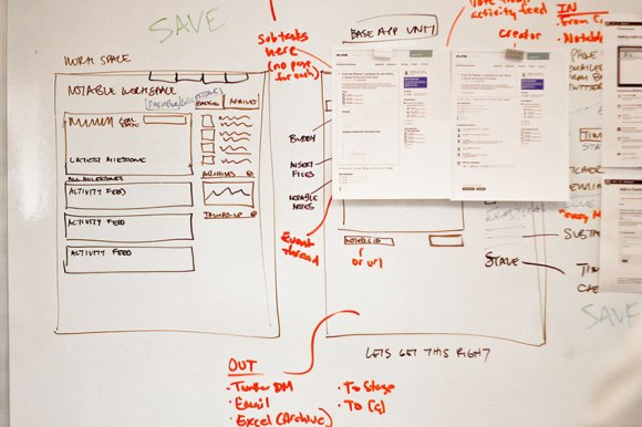
Wireframing is an important part in the planning process to create a streamlined user experience, as it is one of the beginning stages in establishing hierarchy in content organization. Source: http://zurb.com/word/wireframing

Wireframing is an important part in the planning process to create a streamlined user experience, as it is one of the beginning stages in establishing hierarchy in content organization.
Source: http://zurb.com/word/wireframing


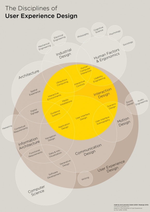
UX isn't just about web design. It's about how the user experiences anything. This chart shows the overlap between different disciplines and UX. Source: http://media-cache-ec0.pinimg.com/736x/ba/b7/a6/bab7a69fa7d1833298f595d97a0a6ac4.jpg

UX isn’t just about web design. It’s about how the user experiences anything. This chart shows the overlap between different disciplines and UX.
Source: http://media-cache-ec0.pinimg.com/736x/ba/b7/a6/bab7a69fa7d1833298f595d97a0a6ac4.jpg


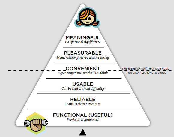
This chart, mirroring Maslow's Hierarchy of Needs, demonstrates the stages a project needs to go through to meet the needs of the user, and then go beyond their needs.  Source: http://sarasoueidan.com/blog/lessons-from-seductive-interaction-design-book/

This chart, mirroring Maslow’s Hierarchy of Needs, demonstrates the stages a project needs to go through to meet the needs of the user, and then go beyond their needs.
Source: http://sarasoueidan.com/blog/lessons-from-seductive-interaction-design-book/